FEATURE · UTILITY
Match the editor to your product.
Light, dark, and auto built in. Pass one brand colour and every accent shade, in the UI and on the map, follows. Design tokens restyle the rest in plain CSS: fonts, radii, surfaces, text, borders and shadows.
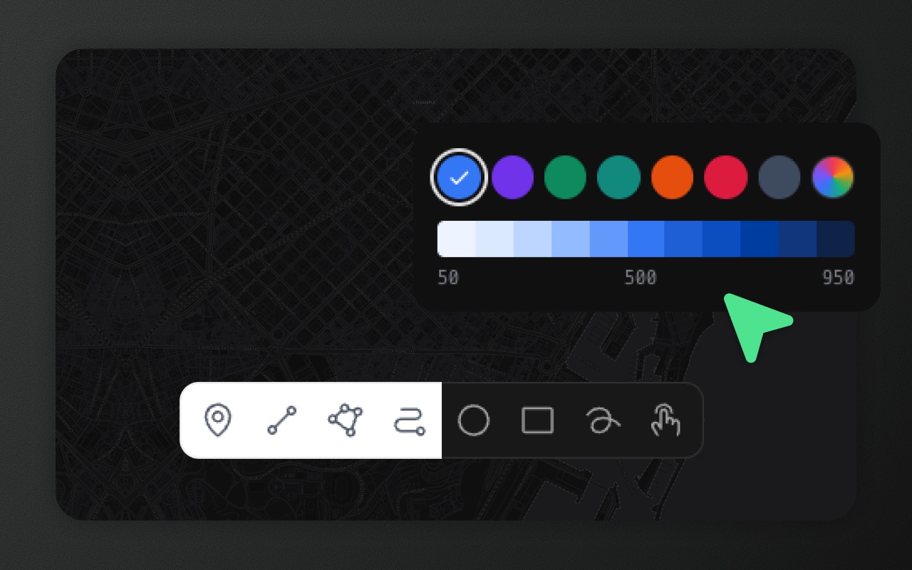
Try it
- 1Pick an accent colour, bottom right
- 2Click the market: the selection follows
- 3Press G and draw: so does the preview
- 4Switch the editor theme, top right: the map follows
From one prop to custom CSS
The quick way — the theme prop:
<ElementEditor theme="dark" />       // dark
<ElementEditor theme="light" />      // light
<ElementEditor theme="auto" /> // respects prefers-color-schemetheme takes 'light' | 'dark' | 'auto' and sets the mode, nothing else. Without it, the editor follows the OS (config.mode defaults to 'system'). Colours go through accentColor, style or your own CSS; an object passed to theme is ignored with a development warning.
The brand-colour way — one accent colour:
<ElementEditor accentColor="#ea580c" />Any CSS colour works: hex, rgb(), hsl(), oklch() or a name like rebeccapurple. Element Editor generates the whole 50–950 scale from it. Light shades are the colour mixed with white, 500 is the colour itself, and dark shades keep its hue and get darker. The default is blue, and the generated default matches Tailwind's blue scale closely.
The same colour reaches buttons, active tools, selection, checkboxes and table selection, and on the map the selection, pins, vertex and transform handles, box-select, drawing previews and snapping, in both the MapLibre and Leaflet editors and adapters. It changes live, without a remount.
Other ways to set it:
config={{ accentColor: '#ea580c' }}<ElementEditorUIProvider accentColor="#ea580c">with an adapterstyle={{ '--elm-accent': '#ea580c' }}on<ElementEditor>(TypeScript accepts--*keys without a cast)- plain CSS:
:root { --elm-accent: #ea580c; }for every editor, or the same variable on one editor's root
To pin one shade, set --elm-primary-N (for example --elm-primary-700). This works on :root, on the editor root, or through style (style={{ '--elm-primary-700': '#c2410c' }}). The map highlights follow the override too.
Feature colours. Features draw in slate by default (a lighter slate on a dark MapLibre basemap). <ElementEditor featureColor="#00a2f0" /> recolours polygons, lines and points in one prop, and getFeatureStyle colours individual features from their data. See Colouring features.
The deep way — design tokens. Every surface, text colour, border, radius, font and shadow in the editor chrome reads a CSS variable. Set the ones you want to change; the rest keep their defaults, which are Element's usual look. Like the accent, they're plain CSS: no prop, no remount, and they update live.
/* every editor on the page */
[data-elm-theme] {
  --elm-accent: #c0582b;
  --elm-font: "Inter", system-ui, sans-serif;
  --elm-radius: 16px;
  --elm-radius-control: 10px;
}
[data-elm-theme="light"] {
  --elm-surface: #fbf6ee;
  --elm-surface-sunken: #f3eadc;
  --elm-text: #3b2a1e;
  --elm-text-muted: #8a6f58;
  --elm-border: #e5d6c0;
  --elm-tooltip: #3b2a1e;
  --elm-tooltip-text: #fbf6ee;
}
[data-elm-theme="dark"] {
  --elm-surface: #2a211b;
  --elm-surface-sunken: #211a15;
  --elm-text: #f6ece0;
  --elm-text-muted: #b9a28b;
  --elm-border: #4a3b30;
  --elm-tooltip: #f6ece0;
  --elm-tooltip-text: #2a211b;
}That's a trimmed copy of the warm theme in the theming guide, which sets every token. [data-elm-theme="light"] and [data-elm-theme="dark"] match the root of every editor on the page, so each mode gets its own values.
For one editor only, add a class and scope the rules to it:
<ElementEditor className="brand-editor" />.brand-editor[data-elm-theme="light"] { --elm-surface: #fbf6ee; --elm-text: #3b2a1e; }
.brand-editor[data-elm-theme="dark"] { --elm-surface: #2a211b; --elm-text: #f6ece0; }Or pass tokens through style. They apply to that editor in both modes, so pick the values by mode yourself if they differ:
<ElementEditor style={{ '--elm-surface': '#fbf6ee', '--elm-text': '#3b2a1e', '--elm-radius': '16px' }} />Set tokens on :root, on [data-elm-theme], on the editor root or on an ancestor of it, never on an element inside the editor. Menus, modals, tooltips, toasts and the pickers render at the end of <body>, outside the editor root; Element copies the token values the root ends up with onto them, so a rule on .brand-editor reaches them too. With an adapter, put the tokens (or the class) on your own [data-elm-theme] wrapper.
For a change no token covers, you can still write CSS against Element's markup under your own class. Its class names are Tailwind utilities and can change in any release, so prefer the tokens.
Design tokens
23 tokens, each with a light and a dark default (Tailwind's gray scale in light mode, a pure neutral scale in dark mode), plus the accent and the row colours:
| Group | Tokens |
|---|---|
| Brand | --elm-accent (default #3b82f6; every accent shade is generated from it), --elm-primary-50 … --elm-primary-950 (one shade) |
| Type | --elm-font, --elm-font-mono (code, coordinates, the GeoJSON editor) |
| Radius | --elm-radius (toolbars, panels, menus; 12px), --elm-radius-control (buttons, inputs, list rows; 6px) |
| Surfaces | --elm-surface, --elm-surface-raised, --elm-surface-sunken, --elm-surface-hover, --elm-control-hover |
| Text | --elm-text, --elm-text-secondary, --elm-text-muted, --elm-text-subtle, --elm-text-disabled |
| Borders and focus | --elm-border, --elm-border-subtle, --elm-border-strong, --elm-focus-ring |
| Shadows | --elm-shadow, --elm-shadow-raised, --elm-shadow-control |
| Tooltips | --elm-tooltip, --elm-tooltip-text |
| Rows | --elm-row-hover, --elm-row-selected, --elm-row-selected-hover, --elm-row-checked, --elm-row-checked-hover (layers list and data table; keep them opaque) |
The token reference lists what each one styles and its light and dark defaults.
Some things stay out of the tokens' reach. Features on the map are props (featureColor, getFeatureStyle), and map text labels keep their own style. The map engine's own controls (Leaflet's zoom buttons, MapLibre's navigation control) keep their look. Errors, warnings and success messages keep their red, amber and green, and the Measure tool stays red.
Light and dark modes share the same accent. To colour your own map layers to match, use accentPalette() from @element-editor/core or useAccentPalette() from @element-editor/ui. See the theming guide.
Dark mode
Enter dark mode with the theme prop:
<ElementEditor theme="dark" />           // always dark
<ElementEditor theme="auto" />           // follows OS preference
<ElementEditor theme={useMyApp().mode} /> // your app's 'light' | 'dark' | 'auto'auto watches prefers-color-scheme and flips live when the user changes their OS setting. No page reload.
When the user picks a theme through the settings panel, the choice persists in localStorage under elm_theme so it sticks across reloads — and it wins over config.mode for that browser. The theme prop, when provided, syncs each time it changes.
Basemaps follow the theme
The default basemap is 'auto': Streets in light mode, Dark in dark mode, switching live when the theme changes. To pin a basemap regardless of theme, use the basemap prop (your app controls it; nothing is remembered). To only choose the starting style, use defaultBasemap:
import { ElementEditor } from '@element-editor/react'

<ElementEditor theme="dark" basemap="dark" />

// Dark chrome over satellite imagery
<ElementEditor
  theme="dark"
  basemap={{
    label: 'Satellite',
    url: 'https://server.arcgisonline.com/ArcGIS/rest/services/World_Imagery/MapServer/tile/{z}/{y}/{x}',
    attribution: '© Esri',
  }}
  basemaps={false}
/>With defaultBasemap, a basemap the user picks is remembered and wins on the next load. Any raster tile URL or MapLibre style works. See the basemaps guide.
Things to know before you ship
- One accent per editor. Each editor resolves its own scale, so two editors on a page can have different brand colours.
- Modern browsers. The scale uses CSS
color-mix()and relative colours (oklch(from …)), fully supported from Chrome 122, Firefox 128 and Safari 18. - Your own portals. A modal or menu you portal to
bodymatches the editor if you spreaduseAccentStyle()from@element-editor/uiinto its style: it carries the accent and the tokens the editor root resolves, from props,styleor your stylesheet. - Dark mode is an attribute, not a media query. Element sets
data-elm-theme="dark"on its root. Its stylesheet also scopes its base styles to[data-elm-theme], so it never restyles the rest of your page. If you render your own portal component (modal, dropdown) outside the root, wrap it in a<div data-elm-theme={theme}>(or give itdata-elm-portal) so it's styled. - Load your fonts yourself.
--elm-fontand--elm-font-mononame the font; Element doesn't ship or load any font files, so load the web font in your page first. - Token values. Colour tokens take any CSS colour; prefer opaque ones for
--elm-surface*, since toolbars and windows add their own 95% opacity over the map. To remove a shadow, set its token to0 0 #0000, notnone.
Works with
- Keyboard shortcuts — the shortcut panel inherits your theme.
- Schemas — the schema editor and property forms use your accent colour.