Theming
Match the editor to your product's visual identity.
Element Editor exposes two complementary approaches: one brand colour that recolours the whole editor, and a small set of design tokens (CSS variables) for everything else: surfaces, text, borders, radius, font, shadows, focus ring and tooltips, per mode and per editor. Light and dark modes are both available and ready to use.
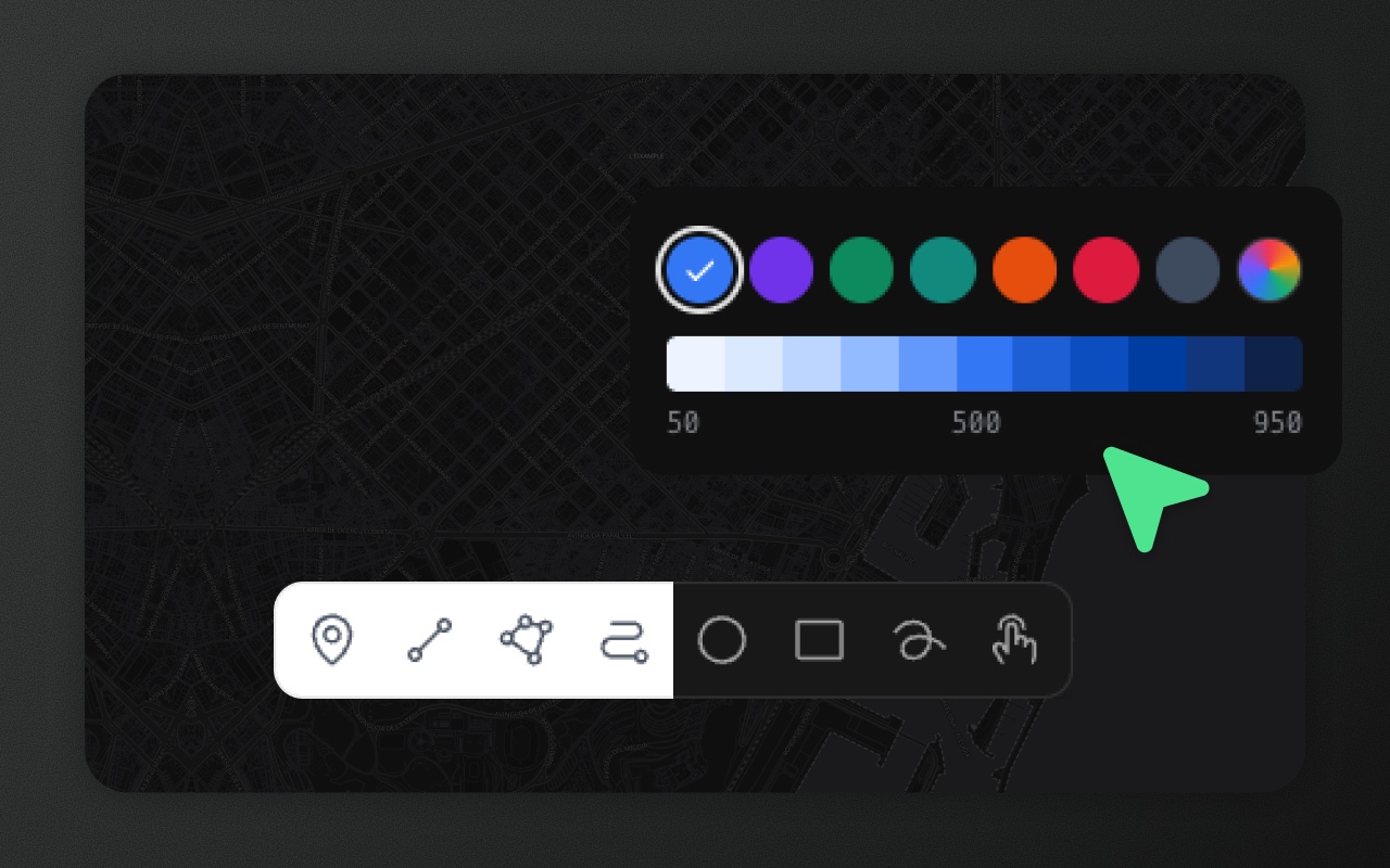
Approach 1 — One brand colour
Give Element one accent colour and every accent shade follows: buttons, active tools, selection, checkboxes, table selection and the map highlights. The default is blue.
<ElementEditor accentColor>
<ElementEditor accentColor="#ea580c" />config.accentColor
<ElementEditor config={{ accentColor: 'rebeccapurple' }} /><ElementEditor style>: CSS variables on the editor root
style is spread onto the editor's root element, so CSS variables in it work like a stylesheet rule on that root. TypeScript accepts --* keys without a cast.
<ElementEditor style={{ '--elm-accent': '#7c3aed' }} />The theme prop only sets light or dark mode: put colours in style or accentColor.
Adapters: <ElementEditorUIProvider accentColor>
<ElementEditorUIProvider accentColor="#059669">
  <div data-elm-theme="light">{/* map + ElementEditorControls */}</div>
</ElementEditorUIProvider>ElementEditorUIProvider renders no DOM, so <ElementEditorControls> writes the colour as --elm-accent onto the nearest [data-elm-theme] ancestor of the map container (or onto the container itself if there is none). config.accentColor on the provider works the same way.
CSS: --elm-accent
/* every editor on the page */
:root { --elm-accent: #7c3aed; }

/* one editor: target its themed root */
.my-editor[data-elm-theme] { --elm-accent: #0d9488; }Set it on :root for every editor, or on one editor's root (or an ancestor of it) for that editor only. Don't set it on an element inside the editor: the scale is computed only on :root, [data-elm-theme] elements and the editor's portal roots, so the UI below would stay unchanged.
Accepted values and live updates
Any CSS colour works: hex, rgb(), hsl(), oklch(), or a named colour such as rebeccapurple. Changing accentColor (prop or config) recolours the editor and its map highlights live, with no remount. A --elm-accent you change from your own CSS recolours the UI and the map highlights, within a frame: the map follows changes to the style or class of the editor root or <html>, <style> and <link rel="stylesheet"> elements added to, removed from or edited in <head>, and stylesheets that finish loading. Edits made through the CSSOM (insertRule, adoptedStyleSheets) and <style> elements outside <head> fire no event, so the map won't see them until one of those changes happens. To force a refresh, set the accent on the editor root or on <html> again.
Precedence
--elm-primary-Nfor that one shade (see below).- On
<ElementEditor>: a--elm-accentpassed throughstyle, which is spread onto the root after the accent. <ElementEditor accentColor>/<ElementEditorUIProvider accentColor>.config.accentColor.--elm-accentfrom your own stylesheet. The props above are applied as an inline style on the editor root, so they win over a stylesheet rule.- The default blue (
#3b82f6).
How the scale is generated
Element builds the 50–950 scale from the one colour in CSS:
- 50–400 are the accent mixed with white (8%, 16%, 30%, 50% and 75% accent, mixed in OKLab).
- 500 is the accent itself.
- 600–950 keep the accent's hue, reduce its lightness and, from 800 on, its saturation. Mixing with black would make them look muddy.
The factors are fitted to Tailwind's blue, so the default accent reproduces the familiar blue scale closely.
Overriding one shade: --elm-primary-N
To pin a single shade, set --elm-primary-50 … --elm-primary-950. The other shades still come from the accent.
:root {
  --elm-accent: #7c3aed;
  --elm-primary-50: #faf5ff;
}On <ElementEditor>, pass it through style (the scale is computed on the editor root itself):
<ElementEditor accentColor="#7c3aed" style={{ '--elm-primary-50': '#faf5ff' }} />The map follows a per-shade override too. Selection outlines, drawing previews, box-select and MapLibre paint read each shade as the browser resolves it on the editor root.
What follows the accent
- UI: buttons, active tools, selection, checkboxes, table selection, focus rings and links.
- Map, on every map engine: selected features, point pins, vertex and transform handles, box-select, drawing previews and snapping indicators.
These keep their own colours: semantic red, green and amber (errors, success, warnings), the neutral greys, the Measure tool (red), the hover grey of uncoloured features and the colours of the OSM trace candidates.
Matching your own layers and UI
If you style your own map layers or components to match the editor, use the same palette from JS. Add @element-editor/core / @element-editor/ui to your own package.json to import from them.
import { accentPalette, readAccentPalette } from '@element-editor/core'

const palette = accentPalette('#ea580c')        // { 50: '#…', …, 950: '#…' }
const inEffect = readAccentPalette(editorRoot) // reads the inherited --elm-accentaccentPalette(color) returns the scale for any CSS colour (unrecognised values fall back to the default blue). readAccentPalette(el) reads the --elm-accent in effect for an element. Inside React, useAccentPalette(el) from @element-editor/ui re-reads when the style or class of the editor's [data-elm-theme] root or of <html> changes:
import { useMap } from 'react-leaflet' // with a MapLibre map, pass map.getContainer() instead
import { useAccentPalette } from '@element-editor/ui'

function MyLayer() {
  const accent = useAccentPalette(useMap().getContainer())
  // e.g. <Polyline pathOptions={{ color: accent[600] }} … />
}The built-in 'auto' basemap of the MapLibre drop-in follows the editor's light/dark mode (see Basemaps). In plain HTML or CSS you can use var(--color-primary-500) (any shade) directly inside the editor.
Portals
Element's modals, menus, tooltips and other body-level portals sit outside the editor root, so they don't inherit its CSS variables. Element copies them over, for the accent and the design tokens alike:
<ElementEditor>: portals getaccentColor(prop or config), every CSS variable ofstyle(--elm-accent,--elm-primary-N, …), with the same precedence as on the root, and every accent or token variable your stylesheet sets for the root.- Adapters: portals get
accentColor(prop or config onElementEditorUIProvider) and the accent and token variables of your[data-elm-theme]wrapper. - Your own stylesheet: a rule like
.my-editor[data-elm-theme]reaches the portals too: Element reads the values the editor root ends up with and copies them on. See How portals get the tokens.
Toasts use the panels' surface in light and dark mode and don't use the accent.
Browser support
The scale uses CSS color-mix() (Chrome 111, Firefox 113, Safari 16.2) and relative colours such as oklch(from …) for the dark shades (full support in Chrome 122, Firefox 128 and Safari 18, per MDN). Older browsers don't render the 600–950 shades correctly.
Try it
The playground has a Brand section with colour presets, a custom colour picker, a text field for any CSS colour and a preview of the generated scale. The generated code includes the matching accentColor prop.
Surfaces, text, borders, radius, font and shadows have their own tokens (Approach 2 below).
Approach 2 — Design tokens
Every surface, text colour, border, radius, font and shadow in the editor chrome reads a CSS variable. Set the ones you want to change; the rest keep Element's look. Like the accent, they are plain CSS: no prop, no JS, no remount, and they update live.
Token reference
The defaults are Tailwind's gray scale in light mode and a pure (zero-chroma) neutral scale in dark mode.
| Token | Role | Light default | Dark default |
|---|---|---|---|
--elm-font | UI font | ui-sans-serif, system-ui, sans-serif, … | same |
--elm-font-mono | Code, coordinates, the zoom level, the GeoJSON inspector | ui-monospace, SFMono-Regular, Menlo, … | same |
--elm-radius | Containers: toolbars, panels, menus, popovers, map buttons. Windows use it + 4px | 12px | same |
--elm-radius-control | Buttons, inputs, list rows. Small chips use it − 2px, tooltips and cards + 2px | 6px | same |
--elm-shadow | Toolbars, menus, popovers, tooltips | 0 20px 25px -5px rgb(0 0 0 / 0.1), 0 8px 10px -6px rgb(0 0 0 / 0.1) | same |
--elm-shadow-raised | Windows (settings, schema editor, inspector) and overlay panels | 0 25px 50px -12px rgb(0 0 0 / 0.25) | same |
--elm-shadow-control | Map buttons and small floating chips | 0 10px 15px -3px rgb(0 0 0 / 0.1), 0 4px 6px -4px rgb(0 0 0 / 0.1) | same |
--elm-surface | Panels, toolbars, menus, windows, toasts (floating ones at 95% opacity over the map) | #ffffff | #171717 |
--elm-surface-raised | Cards and inputs inside windows, a dragged row, inspector popups | #ffffff | #262626 |
--elm-surface-sunken | Panel header bars and footers, the editor background | #f9fafb | #262626 at 50% |
--elm-surface-hover | Hovered menu items and list buttons, a selected segment | #f3f4f6 | #262626 |
--elm-control-hover | Hovered toolbar buttons | #e5e7eb | white at 12% |
--elm-text | Primary text and toolbar icons | #101828 | #ffffff |
--elm-text-secondary | Labels, list rows, menu items | #364153 | #d4d4d4 |
--elm-text-muted | Descriptions, hints, counts | #6a7282 | #a3a3a3 |
--elm-text-subtle | Placeholders, geometry icons, section titles | #99a1af | #737373 |
--elm-text-disabled | Disabled buttons, hidden features | #d1d5dc | #525252 |
--elm-border | Panel and window borders, dividers, separators | #e5e7eb | #404040 |
--elm-border-subtle | Dividers inside lists and windows | #f3f4f6 | #262626 |
--elm-border-strong | Inputs, checkboxes, switch tracks | #d1d5dc | #525252 |
--elm-focus-ring | Keyboard focus rings, the active resize edge | #99a1af | #737373 |
--elm-tooltip | Tooltip background (inverted: dark on a light editor) | #171717 | #ffffff |
--elm-tooltip-text | Tooltip text | #ffffff | #171717 |
The accent (--elm-accent, --elm-primary-N, see Approach 1) and the row colours (--elm-row-*, below) complete the set.
A few spots use a slightly different shade of the same role (a window title one step darker, say). They keep that shade until you set the token, then follow it. The shortcut chips in tooltips and menus mix their colours from --elm-tooltip + --elm-tooltip-text, and from --elm-surface + --elm-text, once both tokens of the pair are set.
Notes:
- Element never sets these variables itself (its defaults live in private
--_elm-*variables), so a token you set anywhere above the editor's elements wins: on the editor root, on[data-elm-theme], on an ancestor or on:root. Don't set one on an element inside the editor. - Colour tokens take any CSS colour. Prefer opaque values for
--elm-surface*: toolbars and windows add their own 95% opacity over the map. - A shadow token takes a
box-shadowlist. To remove a shadow, use0 0 #0000, notnone. - Fonts aren't loaded for you: load the web font in your page, then name it in
--elm-font.
A full custom theme
Set the tokens per mode. The selectors [data-elm-theme="light"] and [data-elm-theme="dark"] match the root of every editor on the page:
/* every editor on the page */
[data-elm-theme] {
  --elm-accent: #c0582b;
  --elm-font: "Inter", system-ui, sans-serif;
  --elm-radius: 16px;
  --elm-radius-control: 10px;
}
[data-elm-theme="light"] {
  --elm-surface: #fbf6ee;
  --elm-surface-raised: #fffcf7;
  --elm-surface-sunken: #f3eadc;
  --elm-surface-hover: #f0e5d3;
  --elm-control-hover: #e9dbc5;
  --elm-text: #3b2a1e;
  --elm-text-secondary: #5c4331;
  --elm-text-muted: #8a6f58;
  --elm-text-subtle: #a8917b;
  --elm-text-disabled: #cdbba6;
  --elm-border: #e5d6c0;
  --elm-border-subtle: #efe5d5;
  --elm-border-strong: #d2bc9f;
  --elm-focus-ring: #b08d68;
  --elm-shadow: 0 20px 25px -5px rgb(90 55 20 / 0.12), 0 8px 10px -6px rgb(90 55 20 / 0.1);
  --elm-tooltip: #3b2a1e;
  --elm-tooltip-text: #fbf6ee;
  --elm-row-hover: #f3eadc;
  --elm-row-selected: #f7e6d8;
  --elm-row-selected-hover: #f2dccb;
}
[data-elm-theme="dark"] {
  --elm-surface: #2a211b;
  --elm-surface-raised: #352a22;
  --elm-surface-sunken: #211a15;
  --elm-surface-hover: #3a2e25;
  --elm-control-hover: #45372c;
  --elm-text: #f6ece0;
  --elm-text-secondary: #e2d2bf;
  --elm-text-muted: #b9a28b;
  --elm-text-subtle: #8f7a66;
  --elm-text-disabled: #5e4d40;
  --elm-border: #4a3b30;
  --elm-border-subtle: #3a2e25;
  --elm-border-strong: #66523f;
  --elm-focus-ring: #a3836a;
  --elm-tooltip: #f6ece0;
  --elm-tooltip-text: #2a211b;
  --elm-row-hover: #33281f;
  --elm-row-selected: #3d3027;
  --elm-row-selected-hover: #46382d;
  --elm-row-checked: #46382d;
  --elm-row-checked-hover: #504033;
}The dev app in the repository ships this theme: run pnpm --filter @element-editor/react dev and open /?demoTheme=warm (add &theme=dark for dark mode).
One editor only
Scope the rules to one editor with className. Its portals still get them (see How portals get the tokens):
<ElementEditor className="brand-editor" />.brand-editor[data-elm-theme="light"] { --elm-surface: #fbf6ee; --elm-text: #3b2a1e; }
.brand-editor[data-elm-theme="dark"] { --elm-surface: #2a211b; --elm-text: #f6ece0; }With an adapter, put the class on your own [data-elm-theme] wrapper.
Through style
style is spread onto the editor root, so the tokens in it apply to that editor in both modes. Pick the values by mode yourself if they differ:
<ElementEditor
  theme="light"
  style={{ '--elm-surface': '#fbf6ee', '--elm-text': '#3b2a1e', '--elm-radius': '16px' }}
/>How portals get the tokens
Modals, menus, tooltips, the basemap picker, the OSM trace picker, drag previews and toasts render at the end of <body>, outside the editor root, so a rule on .brand-editor never matches them. Element reads the token values the editor root ends up with (from any source: your stylesheet, style, :root) and copies them onto each portal, which also carries the editor's mode in data-elm-theme. The copy refreshes when the root's style, class or mode change, when <html>'s style or class change, and when a stylesheet in <head> is added, removed or edited. Changes made through the CSSOM (insertRule, adoptedStyleSheets) aren't seen until one of those happens. Nothing runs per frame: the values are read only on those events.
With an adapter, ElementEditorControls reads them from your [data-elm-theme] wrapper and hands them to ElementEditorUIProvider.
What stays out of scope
- Features on the map:
featureColorandgetFeatureStyle(see Colouring features). Selection, vertex handles and drawing previews follow the accent. - Text labels on the map keep their own style.
- The map engine's own controls (Leaflet's zoom buttons, MapLibre's navigation control) keep their look. The attribution chrome and the popup surfaces Element styles do follow the tokens.
- Semantic colours: red, green and amber for errors, success and warnings, and the Measure tool's red.
Anything else: custom CSS
For a change no token covers, write CSS against Element's markup under your own class:
.brand-editor [data-elm-status-bar] { letter-spacing: 0.01em; }Warning: Element's class names are Tailwind utilities and can change in any release. Prefer the tokens, and pin your Element version if you depend on markup.
Row highlight colours
The layers list and the data table share one set of row colours, defined per mode on [data-elm-theme="light"] and [data-elm-theme="dark"]. Override them there (they must be opaque, because the table's pinned delete column paints over scrolling content):
| Variable | Used for |
|---|---|
--elm-row-hover | Hovered row |
--elm-row-selected | The selected feature, in both the list and the table |
--elm-row-selected-hover | Hovered selected row |
--elm-row-checked | Data table row ticked with its checkbox |
--elm-row-checked-hover | Hovered ticked row |
.my-editor[data-elm-theme="light"] { --elm-row-selected: #f5f3ff; }Colouring features
Features draw in slate (#475569) by default, and in a lighter slate (#94a3b8) on a dark MapLibre basemap (one whose style background is dark, like the built-in dark). Give them your own colour in one prop, then colour individual features from their data:
<ElementEditor featureColor="#00a2f0" />

const byStatus = (f: GeoJSONFeature): FeatureStyle | null => (f.properties.status === 'done' ? { color: '#16a34a' } : null)
<ElementEditor featureColor="#00a2f0" getFeatureStyle={byStatus} />featureColorcolours polygon outlines and fills, lines and points, including features drawn later. Opacity and line weight keep their defaults. It is also a config key (config.featureColor); the flat prop wins, as withaccentColor. Adapter users pass it to<ElementEditorUIProvider featureColor>orconfig.featureColor.getFeatureStyle(feature)returns aFeatureStyle({ color, fillColor, opacity, fillOpacity, weight }, every key optional) ornullfor the default look.fillColorfalls back tocolor. The same function works on both drop-ins and on both adapters'<ElementEditorControls getFeatureStyle>. On Leaflet it may also return any LeafletPathOptions(such asdashArray); MapLibre ignores keys it doesn't know. Leaflet point pins takefillColor, thencolor.- Define
getFeatureStyleat module level or wrap it inuseCallback. It runs for every feature whenever the features change, and on MapLibre a new function re-sends every feature to the map.
Precedence, highest first: the selected look, then getFeatureStyle (per key), then featureColor, then the default slate. A hovered feature keeps its colour on both engines and gets more opaque (MapLibre also thickens the outline and grows points a little). Text labels keep their own style.
Light, dark, and auto modes
The theme prop sets the mode, and only the mode (colours go through accentColor or style, see above):
<ElementEditor theme="dark" />   // Always dark
<ElementEditor theme="light" />  // Always light
<ElementEditor theme="auto" /> // Follows the OS preference via prefers-color-schemeWithout a theme prop, the editor uses config.mode (default 'system', the same as 'auto'). A theme the user picks in the editor's settings is remembered in localStorage and wins over config.mode. A theme prop sets the mode without saving it, so it doesn't leak to other editors on the same site.
In auto mode, Element responds to OS preference changes in real time — no page reload needed.
The resolved mode ('light' or 'dark') is applied as a data-elm-theme attribute on the root element. You can target it in CSS:
[data-elm-theme="dark"] .my-custom-overlay {
  background: #1a1a2e;
}The accent works the same in light and dark mode: pass theme="dark" together with accentColor.
Adapter theming
Adapters don't have a theme prop. Instead, use ThemeContext.Provider from @element-editor/ui and set the data-elm-theme attribute on the wrapping element.
Warning: The
data-elm-themewrapper is required, even for light mode. Element's stylesheet doesn't reset your page: Tailwind's base styles (preflight) apply only inside[data-elm-theme](and inside the editor's own portals). Editor UI rendered outside it shows browser-default fonts and button styles. Keyboard shortcuts also use this element to decide which editor a key press belongs to.
import { ThemeContext } from '@element-editor/ui'

<ThemeContext.Provider value="dark">
  <div data-elm-theme="dark" className="relative w-full h-full">
    <ElementEditorControls ... />
    {/* @element-editor/ui panels rendered here */}
  </div>
</ThemeContext.Provider>The ThemeContext value is read by portaled components (modals, tooltips, dropdowns) that render outside the normal DOM tree. Without it, portaled components default to light mode regardless of the surrounding layout.
Note: For the Leaflet adapter, UI components live outside
MapContainer— make sure theThemeContext.Provideranddata-elm-themewrapper span both the map and the UI panels. See Custom UI with adapters for the full layout pattern.
What's next
- Reference: @element-editor/react — full
ElementEditorPropstable - Custom UI with adapters — the full provider stack including
ThemeContext