FEATURE · UTILITY
Show only what your users need, exactly where they expect it.
Pick a layout, place any built-in control on the map or in a status bar, hide the rest, and add your own buttons that look like they shipped with the editor. It's all props, no forked components.
Layout config and custom slots ship in every package, free under MIT.
Try it
One editor, reconfigured live. Your shapes survive every switch because nothing remounts.
- 1Pick a recipe in the bar
- 2Draw a shape, then switch: it stays, it’s one editor
- 3Open Code to see the props behind it
Every product needs a different editor
A delivery-zone field in a signup form needs one polygon tool and a submit button. A GIS workspace needs layers, a table and every tool. A customer-facing map needs nothing but zoom. A fixed toolbar leaves you hiding buttons with CSS or forking the component.
Element treats its chrome as configuration. The layout prop picks the shell, config.ui.layout says which controls show and where, and slots takes your own React. Every demo on these feature pages is the same <ElementEditor> with different props.
What you get
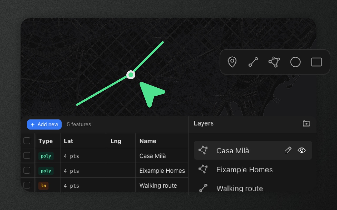
Built-in layouts. panel adds a layers sidebar, minimal keeps the whole area for the map and opens properties in a floating form, split puts the data table and layers in a panel under the map.
Any control, anywhere. Put the drawing toolbar, undo and redo, fit bounds, zoom level, the table button or Apply changes in any map corner, at the middle of any edge, or in a status bar under the map. Join controls into one pill with { group: [...] } and stack a slot vertically.
Hide what you don't need. Controls you don't list don't render. Visibility flags such as dataTable: false also switch off the panel behind a button, config.tools trims the toolbar to the tools you allow, and readonly turns the editor into a viewer.
Your own buttons, native look. Drop React into a corner through slots. The editor exports its IconButton and Tooltip, so a "Share link" button gets the same size, card, hover and tooltip as the built-ins.
Fully custom when you need it. Use an adapter for Leaflet or MapLibre with the components from @element-editor/ui and build your own shell around the same toolbar, panels and store. See custom UI with adapters.
Show it in code
A form field: one tool, undo and redo, and a submit button.
import { ElementEditor } from '@element-editor/react'

<ElementEditor
  layout="minimal"
  onSubmit={(data) => form.setValue('area', data)}
  config={{
    tools: ['polygon'],
    ui: {
      layout: {
        topLeft: ['toolbar'],
        leftCenter: [{ group: ['undo', 'redo'] }],
        bottomRight: ['applyChanges'],
      },
    },
  }}
/>A clear map, with the small controls in a status bar:
<ElementEditor
  config={{
    ui: {
      layout: {
        topCenter: ['toolbar'],
        statusLeft: [{ group: ['undo', 'redo'] }, 'separator', 'fitBounds', 'zoomIndicator'],
        statusRight: ['table', 'geojson', 'settings', 'separator', 'attribution'],
      },
    },
  }}
/>Your own button next to the built-ins:
import { ElementEditor, IconButton } from '@element-editor/react'
import { ShareNetwork } from '@phosphor-icons/react'

<ElementEditor
  slots={{
    topRight: (
      <IconButton label="Share link" onClick={copyShareLink}>
        <ShareNetwork size={24} />
      </IconButton>
    ),
  }}
/>layout, config, readonly and onSubmit all update live. Keep config in a constant or useMemo so it only changes when you mean it to.
Layouts
layout | What it shows | Good for |
|---|---|---|
'panel' (default) | Map with a layers sidebar on the right | Full editing apps |
'minimal' | Map only; properties open in a floating form | Embeds, form fields, viewers |
'split' | Map on top, data table and layers in a panel under it | Data-heavy dashboards |
Where things can go
| Place | How |
|---|---|
Map corners: topLeft, topRight, bottomLeft, bottomRight | config.ui.layout, plus your JSX through slots |
Edge centers: topCenter, bottomCenter, leftCenter, rightCenter | config.ui.layout, plus your JSX through slots |
Status bar under the map: statusLeft, statusRight | config.ui.layout. The bar appears only when something visible is in it |
| Over the whole map | slots.mapOverlay (pointer events off by default) |
| Under the layers panel | slots.panelFooter (panel layout) |
Controls you can place
| Id | What it is |
|---|---|
toolbar | Drawing tools, measure and place search. config.toolbar.direction: 'vertical' stacks it |
undo, redo | History buttons |
fitBounds, locate, zoomIndicator | Fit all features, fly to the user's position, current zoom level |
table, schema, geojson | Open the data table, schema editor and GeoJSON inspector |
settings, keyboard | Editor settings and the shortcuts window |
applyChanges | Validates and calls onSubmit; shows only when you pass onSubmit |
basemap | The basemap picker (when the editor has one) |
attribution | Map credits, in the status bar |
A slot entry is a control id, 'separator' (a thin divider, inside a group or in the status bar) or { group: [...] }. Without ui.layout the editor uses DEFAULT_LAYOUT. To move or hide a few controls and keep the rest, use withLayout({ move: { table: 'topRight' }, hide: ['keyboard'] }). The full rules are in the layout guide.
Things to know before you ship
- Map credits always show somewhere.
attributiongoes only in a status bar slot. Leave it out and it stays on the map, because most tile providers require the credit: shown in full when the map loads, then folded into a small round "i" button after 5 seconds or the first interaction. - Some UI has a fixed place. The bar that appears when you select a shape, the drawing hints and the readonly banner sit at the bottom center of the map. The
panellayout's sidebar is on the right. The drawing toolbar and Apply changes can't go in the status bar. - Leaving a button out doesn't turn its feature off. An unlisted control loses its button, but its keyboard shortcut, if it has one, still works. To remove a feature, use its flag (
dataTable: false,schemaEditor: false,keyboardShortcuts: false) orconfig.tools. ui.cornersandtoolbar.positionare gone in 0.2. The migration guide shows theui.layoutequivalent.
Works with
- Theming: the active state of your own
IconButtons follows the accent colour, like the built-ins. - Drawing tools:
config.toolspicks which tools the toolbar offers. - Data table: place its button anywhere, or use the
splitlayout to keep the table open under the map.